Define a selector as a drawable, and also have a drawable for the selected/unselected states.
For this solution, I started with the code from this answer, and then added the functionality that changes the background color for the current Tab.
First, the selector, tab_background.xml in the drawable folder:
<?xml version="1.0" encoding="utf-8"?>
<selector xmlns:android="http://schemas.android.com/apk/res/android">
    <item android:drawable="@drawable/tab_background_selected" android:state_selected="true" />
    <item android:drawable="@drawable/tab_background_unselected" android:state_selected="false" android:state_focused="false" android:state_pressed="false" />
</selector>
Then, tab_background_selected.xml in the drawable folder:
<?xml version="1.0" encoding="utf-8"?>
<shape xmlns:android="http://schemas.android.com/apk/res/android" >
    <solid android:color="#d13fdd1a" />
</shape>
Then, tab_background_unselected.xml in the drawable folder:
<?xml version="1.0" encoding="utf-8"?>
<shape xmlns:android="http://schemas.android.com/apk/res/android" >
    <solid android:color="#3F51B5" />
</shape>
Finally, in your styles.xml, specify the selector to use, and also specify the tab indicator style, since the app:tabIndicatorColor property in the TabLayout will now be ignored:
<style name="Base.Widget.Design.TabLayout" parent="android:Widget">
    <item name="tabBackground">@drawable/tab_background</item>
    <item name="tabIndicatorColor">#ff00ff</item>
    <item name="tabIndicatorHeight">2dp</item>
</style>
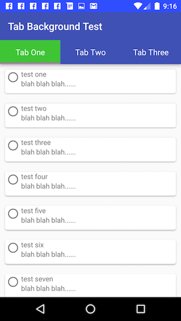
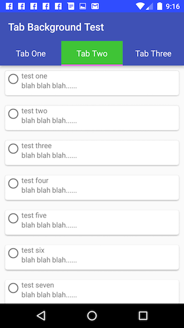
Result with the example colors above:
Additional Note:
Tested with the 23.3.0 versions of the support library components:
dependencies {
    compile 'com.android.support:appcompat-v7:23.3.0'
    compile 'com.android.support:cardview-v7:23.3.0'
    compile 'com.android.support:recyclerview-v7:23.3.0'
    compile 'com.android.support:design:23.3.0'
    compile 'com.android.support:support-v4:23.3.0'
}
与恶龙缠斗过久,自身亦成为恶龙;凝视深渊过久,深渊将回以凝视…


