ActionSheet is a cross-platform React Native component that uses the native UIActionSheet on iOS and a JS implementation on Android. Almost a drop in replacement for ActionSheetIOS except it cannot be called statically.
iOS
Android
Web
Installation
$ npm install @expo/react-native-action-sheet -S
or
$ yarn add @expo/react-native-action-sheet
A basic ActionSheet Setup
1. Wrap your top-level component with <ActionSheetProvider />
App component can access the actionSheet method as this.props.showActionSheetWithOptions
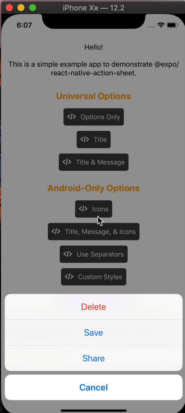
_onOpenActionSheet=()=>{// Same interface as https://facebook.github.io/react-native/docs/actionsheetios.htmlconstoptions=['Delete','Save','Cancel'];constdestructiveButtonIndex=0;constcancelButtonIndex=2;this.props.showActionSheetWithOptions({
options,
cancelButtonIndex,
destructiveButtonIndex,},(buttonIndex)=>{// Do something here depending on the button index selected});};
You can use a hook instead of the higher order component if you are on React 16.8 or newer.
The goal of this library is to mimic the native iOS and Android ActionSheets as closely as possible.
This library can also be used in the browser with Expo for web.
Universal Props
The same options available on React Native's ActionSheetIOS component exist for both iOS and Android in this library. Note: disabledButtonIndices is only available for iOS in Expo 43+ or RN 0.64.0+.
iOS Only Props
Name
Type
Required
Default
anchor
number
No
userInterfaceStyle
string
No
anchor (optional)
iPad only option that allows for docking the action sheet to a node. See ShowActionSheetButton.tsx for an example on how to implement this.
userInterfaceStyle (optional)
The interface style used for the action sheet, can be set to light or dark, otherwise the default system style will be used.
Android/Web-Only Props
The below props allow modification of the Android ActionSheet. They have no effect on the look on iOS as the native iOS Action Sheet does not have options for modifying these options.
Name
Type
Required
Default
icons
array of required images or icons
No
tintIcons
boolean
No
true
textStyle
TextStyle
No
titleTextStyle
TextStyle
No
messageTextStyle
TextStyle
No
autoFocus
boolean
No
false
showSeparators
boolean
No
false
containerStyle
ViewStyle
No
separatorStyle
ViewStyle
No
useModal
boolean
No
false (true if autoFocus is true)
destructiveColor
string
No
#d32f2f
icons (optional)
Show icons to go along with each option. If image source paths are provided via require, images will be rendered for you. Alternatively, you can provide an array of elements such as vector icons, pre-rendered Images, etc.
tintIcons (optional)
Icons by default will be tinted to match the text color. When set to false, the icons will be the color of the source image. This is useful if you want to use multicolor icons. If you provide your own nodes/pre-rendered icons rather than required images in the icons array, you will need to tint them appropriately before providing them in the array of icons; tintColor will not be applied to icons unless they are images from a required source.
textStyle (optional)
Apply any text style props to the options. If the tintColor option is provided, it takes precedence over a color text style prop.
titleTextStyle (optional)
Apply any text style props to the title if present.
messageTextStyle (optional)
Apply any text style props to the message if present.
autoFocus: (optional)
If true, will give the first option screen reader focus automatically when the action sheet becomes visible.
On iOS, this is the default behavior of the native action sheet.
showSeparators: (optional)
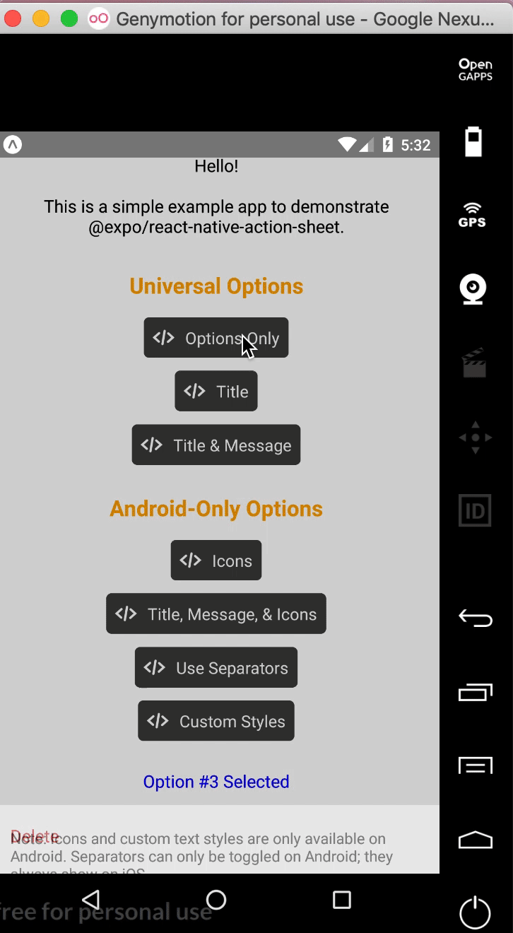
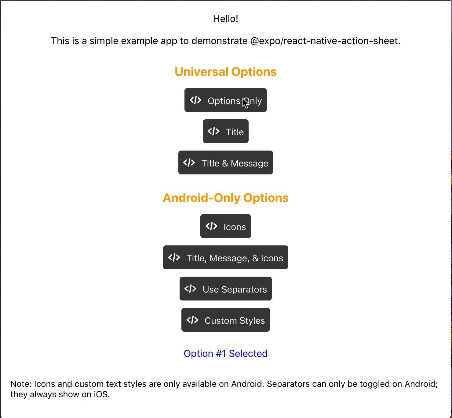
Show separators between items. On iOS, separators always show so this prop has no effect.
containerStyle: (optional)
Apply any view style props to the container rather than use the default look (e.g. dark mode).
separatorStyle: (optional)
Modify the look of the separators rather than use the default look.
useModal: (optional)
Wrap the ActionSheet with a Modal, in order to show in front of other Modals that were already opened (issue reference).
destructiveColor: (optional)
Modify color for text of destructive option.
ActionSheetProvider Props
The following props can be set directly on the ActionSheetProvider
useNativeDriver (optional)
Windows only option that provides the option to disable the native animation driver for React Native Windows projects targeting Windows 10 Version-1809 ; Build-10.0.17763.0 and earlier. useNativeDriver is supported in Version-1903 and later so if your project is targeting that, you don't need to set this prop.

 客服电话
客服电话
 APP下载
APP下载

 官方微信
官方微信


请发表评论