I found an awesome workaround!!!!
I'm so excited to show this because its been bugging me how to implement this for ages.
So here goes;
First, change all of your css files to scss;
For existing projects
Run in console ng set defaults.styleExt=scss
(ng set seems to have been depreciated, but you can check out this for a fix thanks to user @wlyles get/set have been deprecated in favor of the config command )
- Rename all existing
.css files to .scss
- Manually change the file extention of
styles in .angular-cli.json from .css to .scss
- If you didnt use a tool like WebStorm Refactor to rename then manually change all the
styleUrls from .css to .scss
For future projects
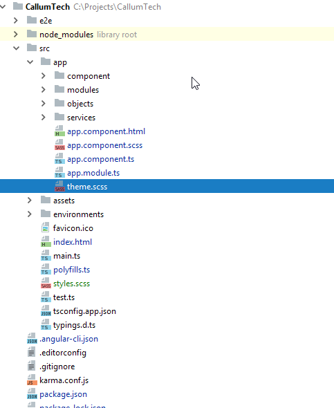
Now you will need to have a theme.scss file in your app root like so:
Now in your style.scss file you want to add the following (as you can see I referrence background-color but you can change this to any element to theme your site however you want):
EDIT: You dont NEED to put this custom @mixin element in your styles.scss you can put it in any one of your *name*.component.scss and then simply import and include it the same way you do with the example given!
@import '~@angular/material/theming';

// Define a custom mixin that takes in the current theme
@mixin theme-color-grabber($theme) {
  // Parse the theme and create variables for each color in the pallete
  $primary: map-get($theme, primary);
  $accent: map-get($theme, accent);
  $warn: map-get($theme, warn);
  // Create theme specfic styles
  .primaryColorBG {
    background-color: mat-color($primary);
  }
  .accentColorBG {
    background-color: mat-color($accent);
  }
  .warnColorBG {
    background-color: mat-color($warn);
  }
}
Now go to your theme.scss file that you use to theme your Material 2 items, if you need help theming check this out: Material 2 Github - Theming guide
Now open your theme.scss and import your style.scss, since my theme.scss is within the root of the /src/app/theme.scss folder I must first go out of it to reference my /src/styles.scss global styling file like so;
@import '../styles';
Then we must actually include our new custom @mixin we created in ALL our themes (if you have multiple like I do, so it changes color according to current selected theme).
Include it above the actual angular-material-theme include, like so:
@include theme-color-grabber($theme);
@include angular-material-theme($theme);
If you have any themes like me add it in the same position like so:
.light {
  $light-primary: mat-palette($mat-blue, 200,300, 900);
  $light-accent:  mat-palette($mat-light-blue, 600, 100, 800);
  $light-warn:    mat-palette($mat-red, 600);
  $light-theme: mat-dark-theme($light-primary, $light-accent, $light-warn);
  @include theme-color-grabber($light-theme);
  @include angular-material-theme($light-theme);

}
You can see I added my theme-color-grabber above the include, it doesnt really matter if its above or below the actual theme because its getting the themes colors which is the main point.
My whole themes.scss looks like this:
@import '~@angular/material/theming';
//We import our custom scss component here
@import '../styles';

@include mat-core();

$theme-primary: mat-palette($mat-red);
$theme-accent:  mat-palette($mat-deep-orange, A200, A100, A400);
$theme-warn:    mat-palette($mat-red);
$theme: mat-dark-theme($theme-primary, $theme-accent, $theme-warn);
//
@include theme-color-grabber($theme);
@include angular-material-theme($theme);
.light {
  $light-primary: mat-palette($mat-blue, 200,300, 900);
  $light-accent:  mat-palette($mat-light-blue, 600, 100, 800);
  $light-warn:    mat-palette($mat-red, 600);
  $light-theme: mat-dark-theme($light-primary, $light-accent, $light-warn);
  @include theme-color-grabber($light-theme);
  @include angular-material-theme($light-theme);

}
And finally we can now call on our themes color for a background ANYWHERE!, for instance I give a mat-grid-tile the 'primary' color (it doesn't take the color='' argument, like other elements such as mat-toolbar) by simply setting its class to the appropriate class name like so:
EDIT: In each of your components scss files, you will need to import '<path-to>/theme.scss' in order for your theme to apply to that component. Don't import theme.scss in styles.scss because that will create an import loop!
<mat-grid-list cols="4" rows="4" rowHeight="100px">
  <mat-grid-tile
    colspan="4"
    rowspan="5"
  class="primaryColorBG">
    <div fxLayout="column" fxLayoutAlign="center center">
      <h1 class="title-font">Callum</h1>
      <h1 class="title-font">Tech</h1>
    </div>
    <p>
      Ambitious and ready to take on the world of Information Technology,<br>
      my love for programming and all things I.T. has not wavered since I first got access<br>
      to my fathers computer at age 9.
    </p>
  </mat-grid-tile>

</mat-grid-list>
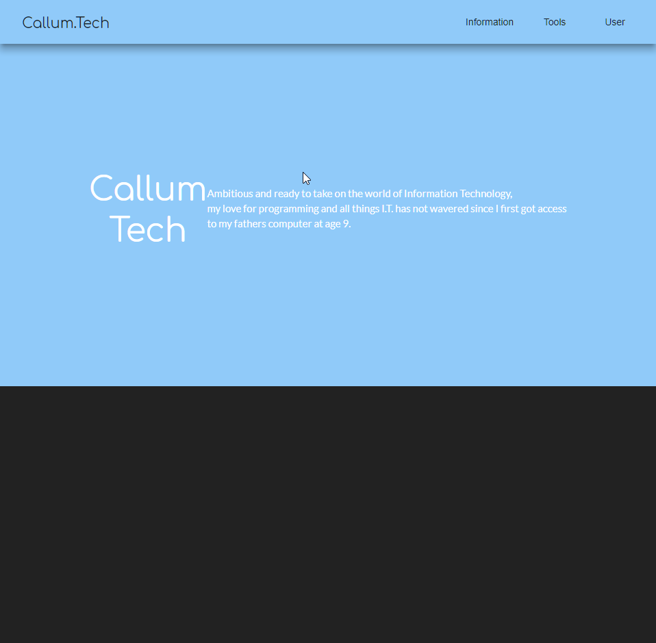
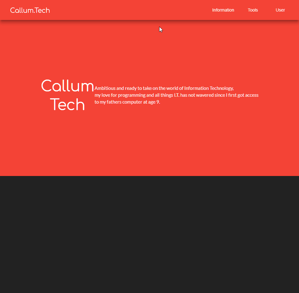
Finally our result will look like this!:
Red theme active
Blue theme active